The cure or the disease? Vinyl has its advantages, particularly for small interior signs, but outdoor vinyl peels. Once it does, you have to either live with an advertising statement like this, or purchase another new vinyl sign. A painted sign, which takes much longer to peel or fade, can often be repainted for less than the cost of an entirely new sign.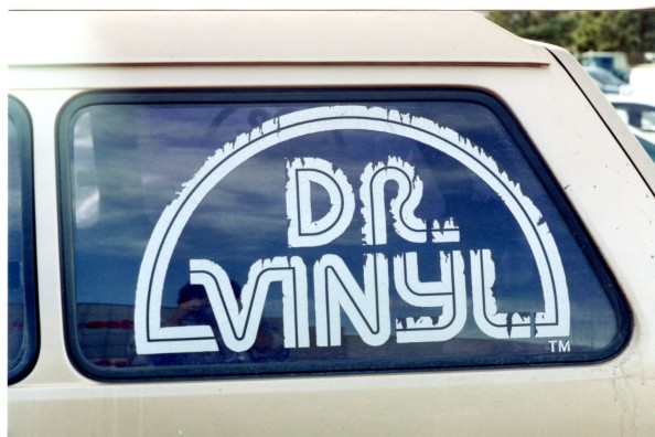
Another vinyl sign fail contestant. An insipid layout to start with, this is also an example of how vinyl fails to adhere to all surfaces. This restaurant is no longer in business, even though the owner saved "so much" money on his sign!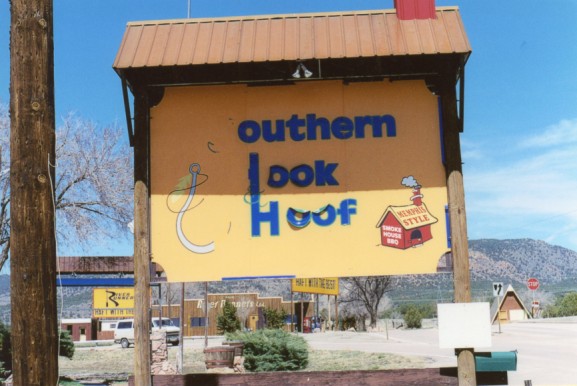
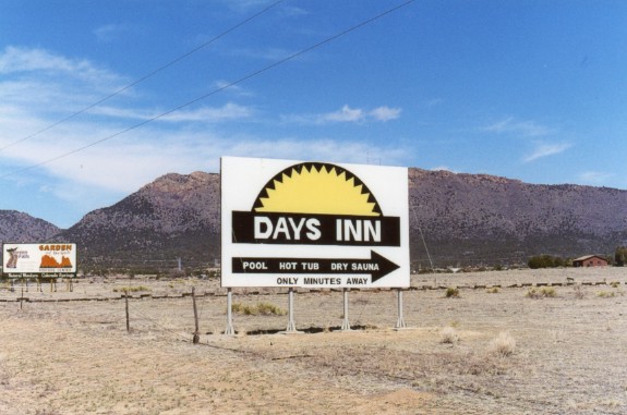
This example demonstrates almost everything I hate about modern vinyl billboards. There are too many mistakes in this layout to catalog. The irony is the completely "invisible" or "camouflaged" effect which is achieved. A complete laugh, and a waste of advertising dollars.


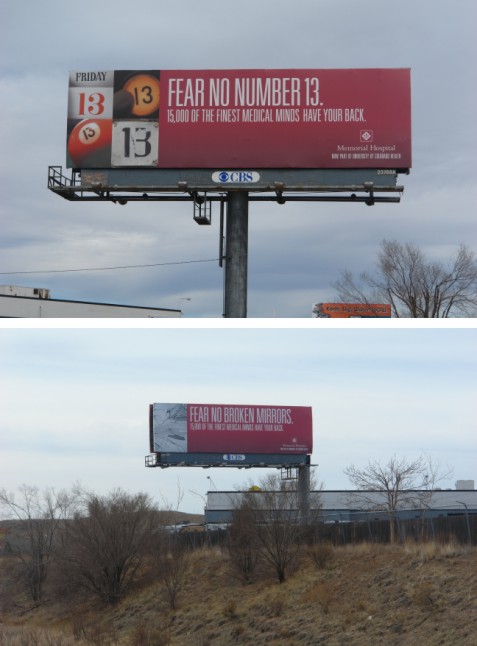
Speaking of ridiculous, invisible billboards; you'll have to cough up big bucks, for an advertising agency, in order to get ones this bad! The top photo is a close-up, taken from the field immediately below the sign. 99% of viewers, driving in their cars at 75 mph on the highway, will be much further away. They will not be able to read the skinny, condensed letters, let alone discern the cryptic message or the microscopic hospital logo, even if their lives depend on it!
Many advertising agencies are notorious for their "Emperor's New Clothes" campaigns. I started out working for advertising agencies in Denver. Believe me, I know their inherent flaws and shortcomings. Do not rely on them to design any outdoor advertising! Instead, call me at 719 209 0730. I have the aptitude, training, and experience necessary to create visually effective signs, as well as other attractive, cost efficient advertisements for your company.
An ugly painted sign, with ungainly letters and no fidelity to the corporate logo or the customer's best interests.
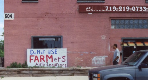
Your credibility is at stake with every sign you exhibit. Who do you trust: this guy, or Farmers Insurance? Also note how this man's vinyl sign is peeling.
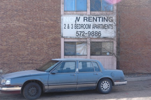
No renting? Non renting? You see a lot of this. I call it "trash blindness". The cheap, trashy sign attracts cheap, trashy customers. The owner cannot see the difference an attractive, well designed sign would make. True bottom feeders always seek out the very lowest price, at the expense of value, whenever they buy anything. This landlord can't even take 5 minutes to cut down the Chinese Elm (a weed with a trunk) which is blocking his sign and endangering his building's foundation. What a way to go through life.
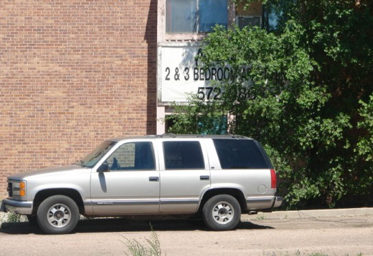
Communication breakdown.
